Edition · Maison Adage
On the wall, by your side.
A Swiss editorial house of typographic prints. Quiet words, chosen for what they support in you: confidence, momentum, the courage to act, the art of continuing.
01
The house
Maison Adage publishes typographic prints, made to hang where you work, where you think, where you return. Each adage is chosen for one precise thing: to hold steady, without raising its voice, in the moments when you need it most.
On bright days, these lines carry the momentum forward. On quieter days, they remind you of what you already know. Week after week, their presence becomes a quiet support, at eye level, several times a day.
02
Glimpse
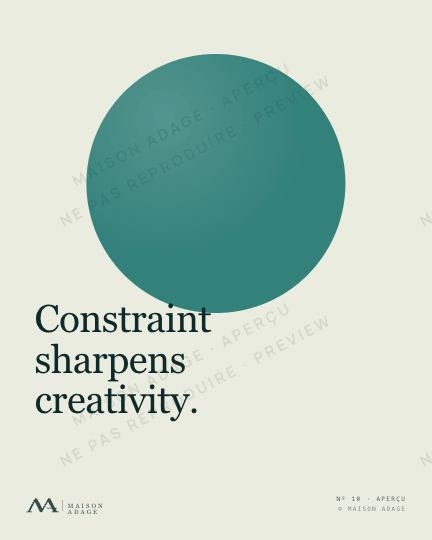
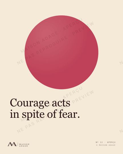
A selection · English
03
The themes
What they accompany you through, in a working life
01
Self-confidence
For the days when you doubt your own standing.
02
Initiative
For the moments when you must dare to speak, propose, act.
03
Execution
When an idea wants to become a gesture, and someone has to take the first step.
04
Learning
To turn every mistake, every detour, into a path.
05
Collaboration
Because no one truly moves forward alone.
06
Leadership
For those who carry a team, and let themselves be carried in return.
07
Perseverance
For the days when you simply need to keep going.
08
Creativity
To release what you have been holding back.
09
Focus
Choosing is already moving forward.
10
Courage
For the steps you did not dare to take.
04
The variations
One phrase, several voices, chosen for the room
A
Editorial
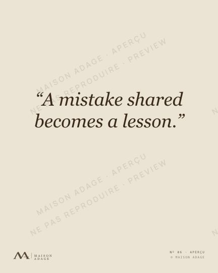
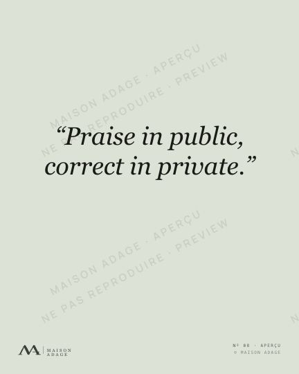
The classic. Tone on tone. Deep ink on ivory, linen or sage paper. For interiors that read in a low voice.
B
Swiss
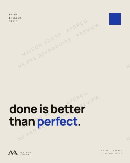
Contemporary precision. Vermilion, Klein blue or olive on a light ground. Clean geometry, firm presence. For rooms that stand straight.
C
Midnight
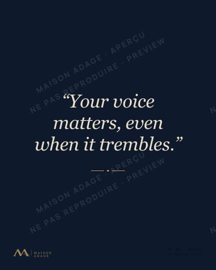
Velvet. Light text on a deep field, midnight, forest or burgundy. For rooms where the phrase lights up the evening.
D
Riso
Today's silkscreen. Vibrant colors, sunset, lagoon, peony. For walls that want a touch of music.